Wyłowione
From the sea straight to the table. The new face of seafood in street food.
How the transformation of branding has revealed the new face of seafood in street food.
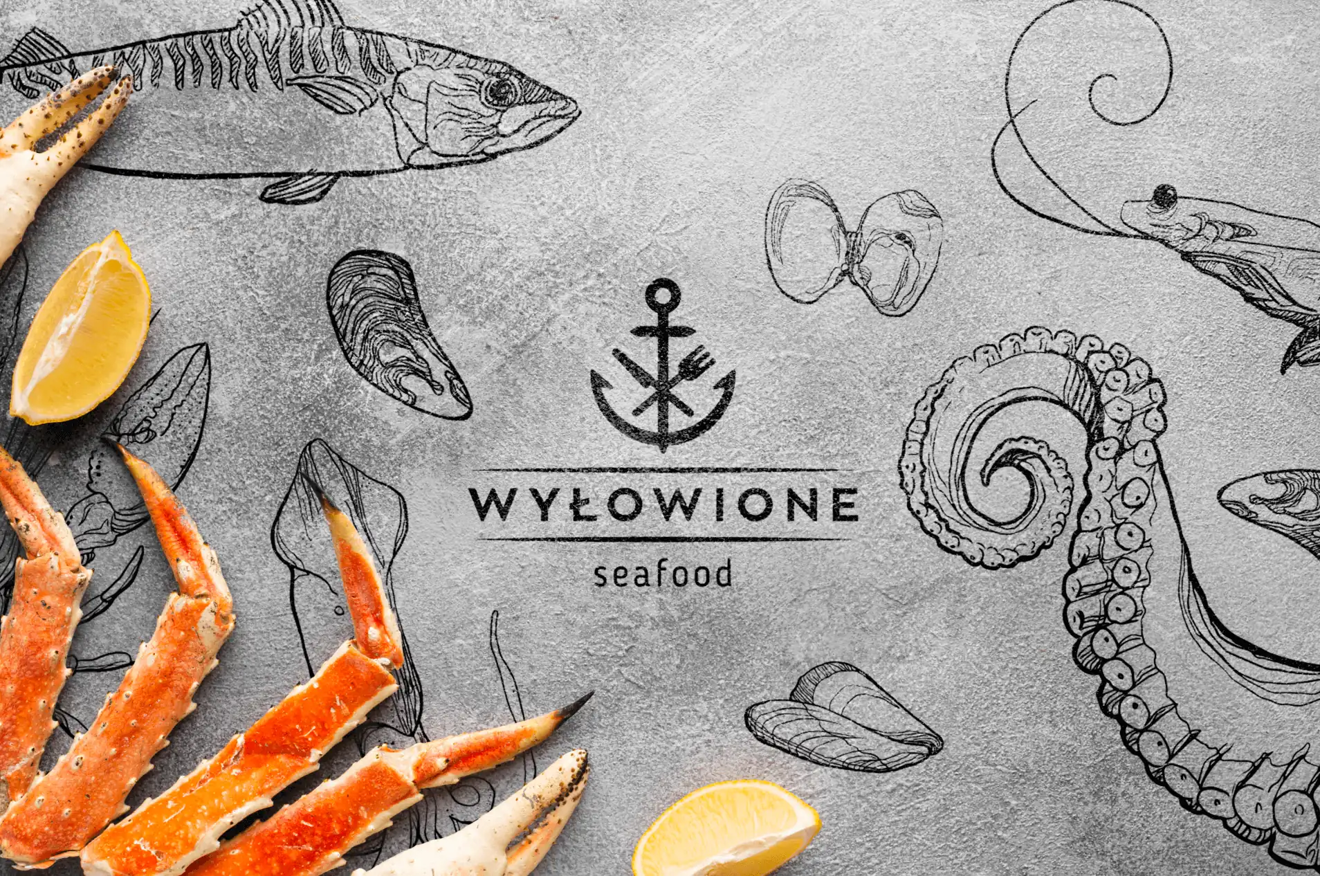
Grappling with the challenge of presenting seafood as an accessible culinary experience rather than an elitist and extravagant image, our first step was to design a modern, minimalist yet distinctive logo. We wanted it to emphasize a strong touch of Mediterranean cuisine.
The secret of our success was the choice of a simple but strongly resonant font and signet that perfectly reflected the character and atmosphere of the restaurant. The symbolism of the anchor, symbolizing the catch of the sea, combined with cutlery, as a representation of cuisine and food, was key in our effort to create a cohesive composition. As a result, the message “from the sea straight to the table” was clearly and effectively conveyed.
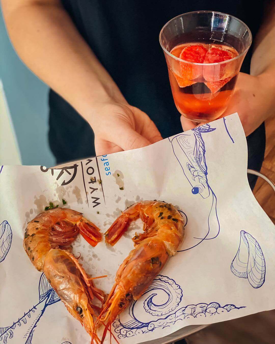
Expanding on our vision, we introduced free hand-drawn illustrations and a wave motif, adding a modern and streetfood touch to the overall look. The end result? The project’s goals have been achieved, and seafood has been presented as an accessible and common culinary experience, attracting attention and changing previous perceptions of the category in street food.
2018
Services
- Art direction
- Branding
- Graphic design

Graphic Designer / Illustrator
Paulina Rymer